
The living room is the hardest-working room in the house. It is where you collapse after work, where you entertain, where you argue and reconcile, where you watch television and read and nap and think. It has to do several jobs at once—and it has to do them all in a single palette.
This is why colour choice in a living room matters more than almost anywhere else. Get it wrong and the room feels restless, cold, or oppressive. Get it right, and the room simply works—you feel calmer, more social, more at ease, without quite knowing why.
The answer lies in colour psychology: the study of how different shades affect mood, perception, and behaviour. It is not a precise science, and personal associations matter enormously. But there are patterns—and understanding them makes choosing a scheme far less daunting.
The Fundamentals
Before turning to individual colours, it helps to grasp three principles.
1. Warm vs. Cool
Warm colours—reds, oranges, yellows, and the earth tones derived from them—feel stimulating, intimate, and enclosing. They draw walls visually closer, making large rooms feel cosy.
Cool colours—blues, greens, violets—feel calming, spacious, and airy. They push walls back, making small rooms feel larger.
Most living rooms benefit from a balance. A cool-dominant scheme with warm accents, or vice versa, tends to feel more liveable than an extreme in either direction.
2. Light and Depth
Lighter tints reflect light and make rooms feel bigger and brighter. Deeper shades absorb light and create intimacy, drama, and a sense of enclosure.
In London, where living rooms are often north-facing and short of natural light, a mid-tone wall with a lighter ceiling is usually the safest and most flattering combination.
3. Saturation
Highly saturated colours (strong, pure hues) excite the nervous system. Desaturated colours (muted, greyed, or earth-toned) soothe it. For a room you use every day, lower saturation is generally more restful—and easier to live with for years.
The Colours, One by One
Blue: The Calm Communicator
Blue is the most popular colour for living rooms, and for good reason. It lowers heart rate and blood pressure, promotes a sense of calm, and reads as trustworthy, serene, and spacious.
- Best for: North-facing rooms, small rooms, and rooms used for rest and conversation.
- Watch out for: Pale blues can feel cold in low light. Warm them with wood, wool, brass, and cream.
- Pair with: Warm whites, natural linen, terracotta, and weathered timber.
Deep blues—navy, ink, midnight—are a different creature entirely. They are dramatic, enveloping, and surprisingly cosy in evening light. Excellent for a snug or a room used mostly after dark.
Green: The Restorative Neutral
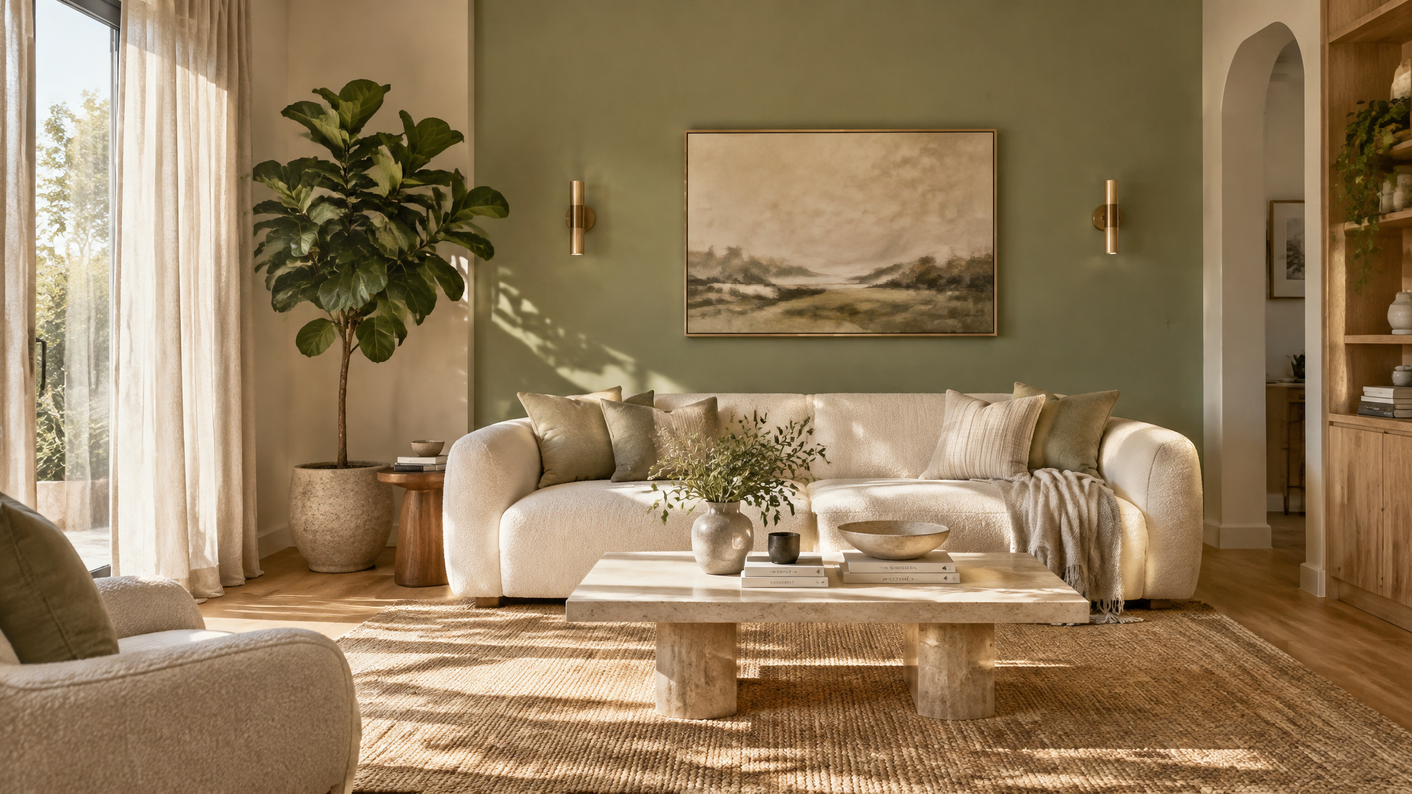
Green sits at the centre of the colour spectrum and is the easiest colour for the human eye to process. It signals nature, balance, and renewal. It is genuinely restful—so much so that green rooms are often used in hospitals and theatres for recovery.
- Best for: Almost any living room. It is the most versatile family of colours.
- Try: Sage, olive, eucalyptus, moss, and forest green.
- Pair with: Warm whites, natural timber, brass, blush pink, and rust.
Green is the great connector. It works with both warm and cool schemes, with traditional and modern furniture, and in small and large rooms alike.
Grey: The Quiet Backdrop
Grey has dominated interiors for two decades, and its appeal is easy to understand: it is neutral without being boring, sophisticated without being loud, and it flatters almost any furniture.
- Best for: Rooms with plenty of natural light, and for creating a calm, contemporary base.
- Watch out for: Cool greys in a north-facing room can feel bleak. Choose “greige” or warm grey with a hint of brown or green.
- Pair with: Almost anything—yellow, navy, blush, mustard, or black and white.
The risk with grey is blandness. It works best as a backdrop, lifted by strong texture, artwork, and a bold accent colour.
Warm Neutrals: The Comfort Zone
Cream, oatmeal, sand, taupe, and stone are the quiet workhorses of living room design. They are warm, flattering to skin tones, and endlessly accommodating.
- Best for: Rooms that need to feel calm, generous, and timeless.
- Pair with: Deeper earthy accents—rust, olive, chocolate—or cool contrasts like slate blue.
Warm neutrals are the safest choice in the book. They are also, at their best, deeply beautiful.
Yellow: The Optimist
Yellow lifts mood and stimulates conversation. In a living room, it works best in muted, earthy forms—ochre, mustard, honey—rather than bright primary yellow, which can quickly become jarring.
- Best for: Dark rooms, north-facing rooms, and social spaces.
- Use sparingly: As an accent wall, in upholstery, or through cushions and art.
- Pair with: Grey, navy, olive, or white.
Terracotta and Rust: The Warm Embrace
Earthy reds—terracotta, rust, brick, clay—are having a resurgence, and it is easy to see why. They are warm, grounded, and flattering, and they bring a sense of comfort and connection to the natural world.
- Best for: Creating intimacy and warmth in larger rooms.
- Pair with: Olive green, cream, timber, and brass.
These are the colours of London brick and autumn leaves. They feel like home.
Pink: The Softener
Pink has shed its nursery associations. In its muted forms—blush, rose, plaster, dusty pink—it is sophisticated, warm, and quietly uplifting.
- Best for: Adding warmth to cool schemes and softness to hard-edged modern rooms.
- Pair with: Grey, green, navy, or brass.
Purple: The Introvert
Purple is the colour of contemplation and creativity. Soft lavenders are soothing; deep aubergines are dramatic and luxurious.
- Best for: Bedrooms and reading corners. In living rooms, use as an accent rather than the dominant tone.
- Pair with: Grey, mustard, gold, or green.
Red: The Stimulant
Red raises the pulse, literally. It is the most stimulating colour in the spectrum—energetic, passionate, and assertive.
- Best for: Accents only, in most living rooms. A red sofa, a red lampshade, a red artwork.
- Watch out for: Full red walls in a room used for relaxation. They can feel aggressive and make the space seem smaller.
- Pair with: Warm neutrals, deep green, or black and white.
Putting It Together: The 60-30-10 Rule
A dependable framework for any living room:
- 60% dominant colour. The walls, and possibly the floor or a large sofa. This sets the mood.
- 30% secondary colour. Curtains, rug, upholstery, cabinetry. This supports and complements the dominant tone.
- 10% accent colour. Cushions, art, ceramics, flowers. This is where personality and energy come from.
Keep to three colours—plus neutrals—and the room will feel coherent rather than chaotic.
Practical Considerations for Living Rooms
Living rooms have particular challenges: limited light, limited space, and often awkward proportions.
- North-facing rooms. Avoid cool greys and icy blues. Choose warm whites, soft greens, ochres, and terracotta. Add mirrors and layered lighting.
- Small rooms. Go lighter on walls, darker on the floor, and use the ceiling as a fifth wall. Consider painting walls and ceiling in the same colour to blur the boundaries and make the space feel taller and more expansive.
- Period properties. High ceilings and original cornices can carry stronger, deeper colours than modern boxes. Georgian and Victorian rooms look wonderful in muted greens, deep blues, and earthy reds.
- Rented flats. If you cannot paint the walls, colour psychology still applies—through rugs, curtains, cushions, art, and lampshades.
The Emotional Test
Colour psychology offers useful guidance, but it cannot tell you what you will love living with. The most reliable test is emotional.
Ask yourself:
- How do I want to feel in this room? Calm? Energised? Cosy? Sociable?
- Which colours make me feel that way when I see them?
- How does the room look at the times of day I actually use it?
Live with a sample patch on the wall for a week. Watch it in morning light, in the afternoon, and under a lamp at night. Colour changes with light—and so does mood.
The Point
Colour is not decoration. It is atmosphere. It shapes how a room feels before a single piece of furniture is placed in it.
Choose calm and you will rest, choose warmth and you will gather. Choose depth and you will retreat. The living room is where life happens—and its colour should be chosen to serve the life you actually live in it.
Get that right, and everything else falls into place.