
In the visually saturated world of marketing, standing out is not just a benefit it’s a necessity. Among the myriad options available for outdoor advertising, one method that offers notable visibility and flexibility is the use of bollard covers. Particularly, square bollard covers and printed bollard covers provide an eye-catching and effective platform for branding and advertising in urban and retail environments.
This post explores how colour choices can dramatically enhance the impact of these covers, turning ordinary safety features into powerful marketing tools.
Understanding Bollard Cover Printing
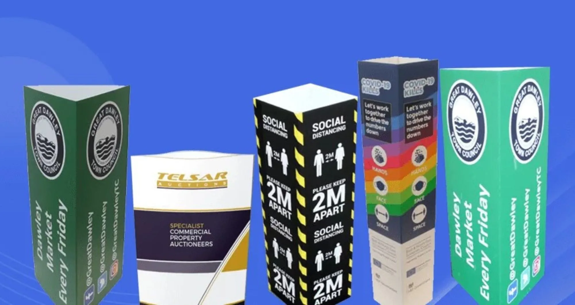
A bollard cover is essentially a sleeve that slides over security or traffic bollards. These covers not only protect the bollard but also offer a prime advertising space thanks to their prominence at pedestrian eye level. Whether you opt for square bollard covers or other shapes, the surface is ideal for printing and can be customised with vibrant colours and graphics.
Businesses utilise bollard covers in various ways, from reinforcing their brand presence to announcing sales and promotions. Due to their strategic placement in high-traffic areas such as car parks, shopping centres, and transport hubs, they naturally draw the attention of passersby. This makes them an ideal medium for increasing brand awareness while also serving a functional purpose.
Bollard covers can be made from a variety of durable materials, including Correx, PVC, and plastic. These materials ensure longevity and resistance to different weather conditions, making them a cost-effective and long-lasting advertising tool.
The Psychology of Colour in Marketing
The colours chosen for bollard covers can influence consumer behaviour and brand perception significantly. According to colour psychology, different hues can evoke specific emotions red can inspire excitement, blue can build trust, and yellow can convey happiness and optimism. It’s essential to choose colours that not only attract attention but also align with your brand identity to reinforce your message effectively.
Below are some common colour associations in UK marketing:
| Colour | Emotion/Association |
| Red | Excitement, Passion |
| Blue | Trust, Professionalism |
| Green | Nature, Tranquillity |
| Yellow | Optimism, Warmth |
| Black | Sophistication, Luxury |
These colour associations can be instrumental in determining how potential customers interact with a brand. For example, a luxury car brand might opt for black bollard covers to reinforce an image of exclusivity, whereas a health-conscious brand might lean towards green to highlight its eco-friendly ethos.
Best Practices for Colour Selection in Bollard Cover Design
- Maintain Brand Consistency: Ensure the colours align with your brand’s existing colour palette to reinforce recognition and loyalty.
- Create a Seamless Marketing Experience: If your brand consistently uses specific colours, replicate them in bollard covers for a uniform look across all advertising mediums.
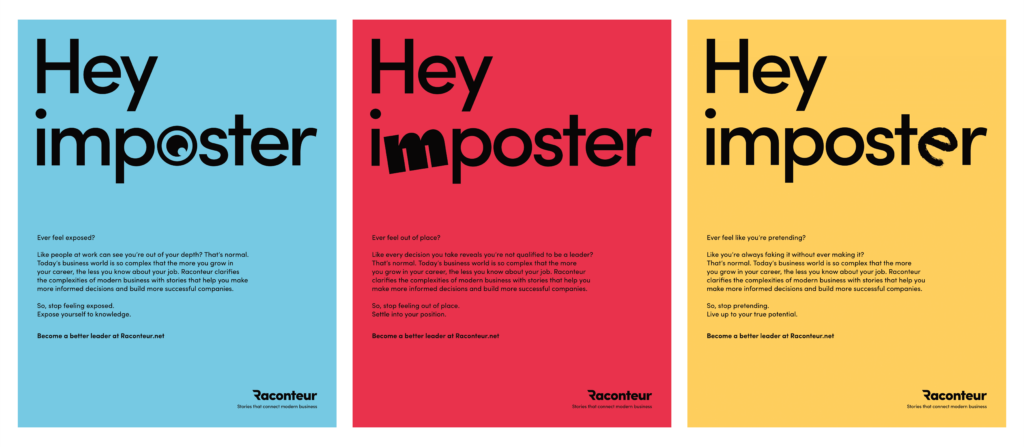
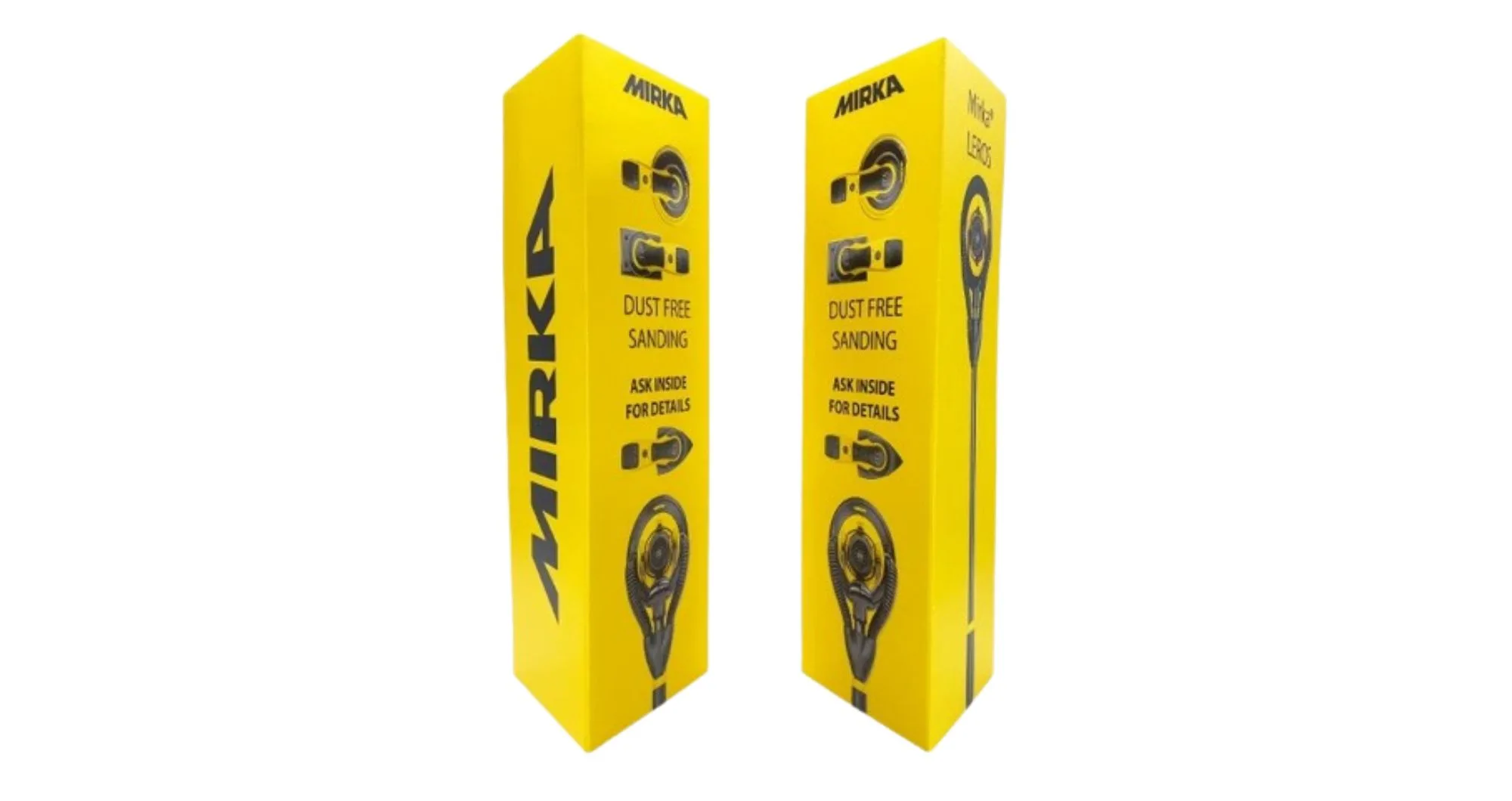
- Use High Contrast: A light-coloured background with dark text or vice versa improves readability and makes the message stand out.
- Enhance Visibility: High-contrast designs help pedestrians and drivers quickly absorb the information, increasing advertising effectiveness.
- Keep the Design Simple: Bollard covers have limited space, so opt for a concise and visually striking message rather than an overly detailed or intricate design.
Technical Considerations in Colour Printing
Transitioning from a digital design to a physical print involves crucial considerations. One of the most significant aspects is colour fidelity. Digital designs are created in the RGB (Red, Green, Blue) colour model, whereas printed materials use CMYK (Cyan, Magenta, Yellow, and Black). The conversion from RGB to CMYK ensures that the colours appear as intended on the final print.
Moreover, the choice of material affects how colours are displayed. Glossy finishes can make colours appear more vibrant, whereas matte finishes can provide a more subdued, sophisticated appearance. Understanding these nuances can help brands make informed choices when designing their printed bollard covers.
Case Studies: Effective Use of Colour in Bollard Covers
A well-known retail chain wanted to maximise visibility for its seasonal sales and attract more customers to its stores. To achieve this, they used bright red and yellow bollard covers strategically placed at the store entrance and throughout the parking area. These bold colours were chosen to evoke urgency and excitement, encouraging passersby to take notice of ongoing promotions.
The results were significant. The highly visible bollard covers caught the attention of customers from a distance, drawing more foot traffic into the store. Additionally, the strategic placement helped reinforce promotional messaging, ensuring shoppers remained engaged with the sale throughout their visit. The campaign led to a noticeable increase in customer inquiries about the promotions and a boost in overall sales during the seasonal period.
Content Disclaimer: The information in this content is for general informational purposes only. The case study provided is illustrative and not based on real-life data.
Tips for Designing Impactful Bollard Covers
- Simplicity is Key: A clean and straightforward design often makes a stronger impact than an overly busy one. Simple, bold colours with clear messaging catch the eye quicker and from further away.
- Testing and Feedback: Before finalising the design, consider prototyping and gathering feedback to ensure the colours and graphics work as intended in the real world.
- Professional Consultation: Utilising the expertise of design professionals can help in selecting optimal colours and graphics that convey your brand’s message effectively.
- Strategic Placement: Consider where the bollard covers will be installed. If they are in high-traffic areas with many competing visual elements, opt for colours that contrast with the surroundings to maximise impact.
- Weather Resistance: If your bollard covers will be exposed to the elements, ensure that the materials and colours are UV-resistant to prevent fading over time.
Conclusion
Choosing the right colours for your bollard covers can transform them from mere safety features to potent marketing tools. The visual appeal and strategic placement of these covers can greatly enhance brand visibility and message delivery. Whether you are considering square bollard covers or custom shapes, the design and colour choices should be made with your brand identity and target audience in mind. For those looking to make an impactful statement, Printed Bollard Covers offers professional guidance and high-quality printing services to ensure your bollard covers stand out in the crowded urban landscape.
This approach to choosing and utilising colours effectively ensures that every element of your outdoor advertising works hard to attract and engage potential customers, maximising your marketing efforts and driving better results.