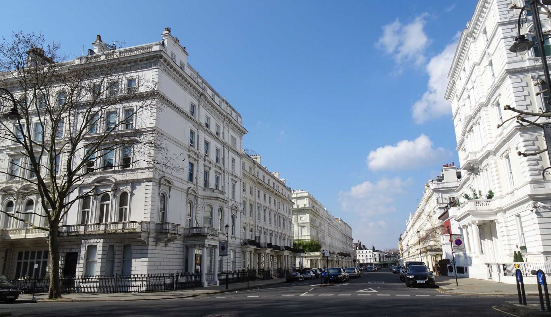

On a London street lined with pale stucco, every facade can seem the same colour. Look closer: one is chalky, another buttery, a third almost grey. Those tiny differences help each building belong to its surroundings.
London’s favourite colour is rarely white
From Georgian terraces to converted warehouses and contemporary offices, London has a rich vocabulary of pale finishes. An apparent white may contain ochre, grey, green or pink. Almost invisible on a swatch, these undertones become unmistakable across a four-storey facade.
A warm stone shade can soften a rendered building, while a cooler off-white may define ornate cornices and window surrounds. Yet brilliant, blue-toned white on a street of mellow brick and weathered Portland stone can look oddly detached from its neighbours.
Why the same white changes throughout the day
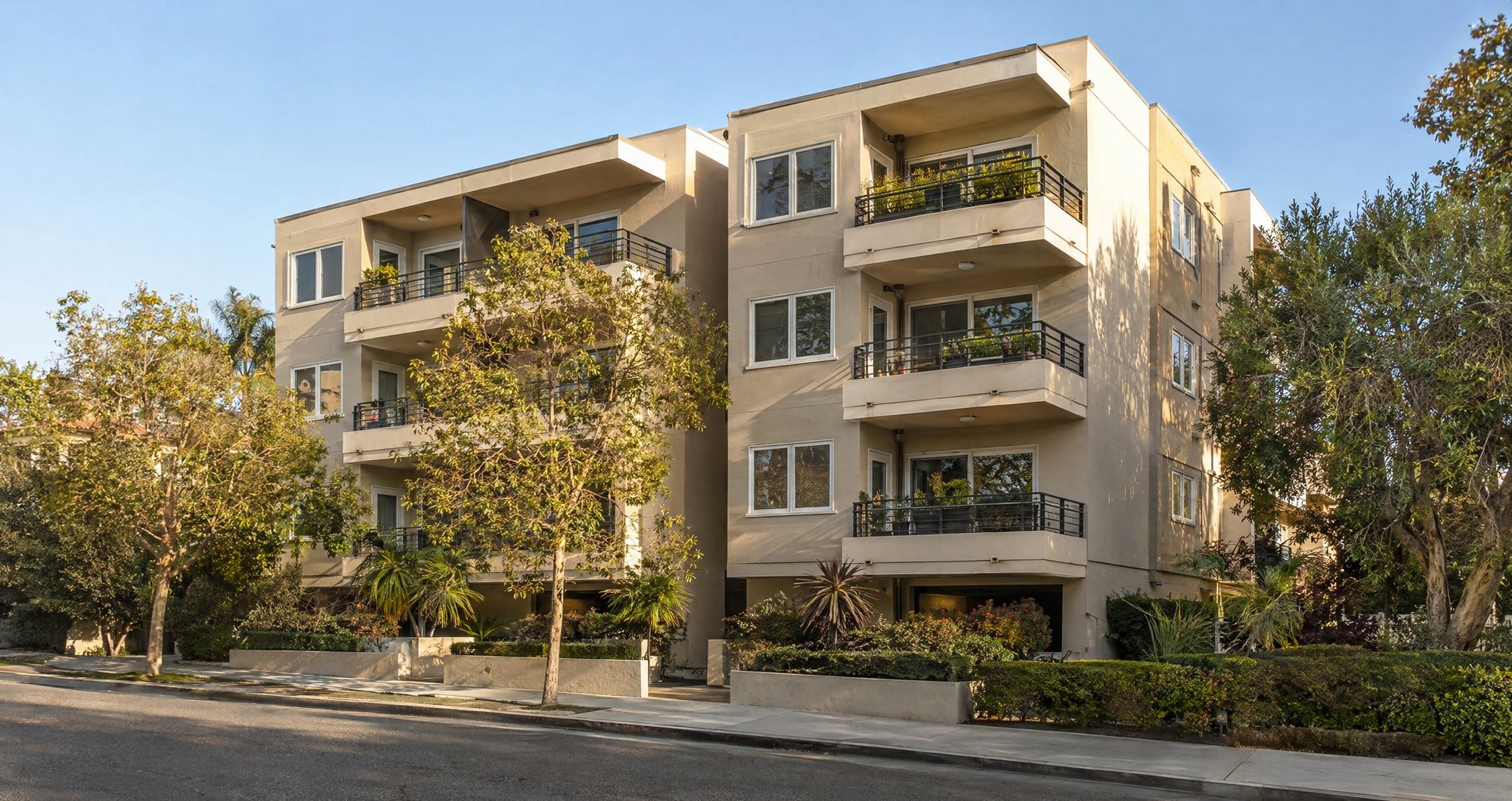
Light is the most unpredictable member of any decorating team. Cooler, diffuse daylight on a north-facing elevation can make neutral paint appear blue or grey. Sunlight on a south-facing wall may reveal yellow undertones invisible on the sample card. Two sides of one building can appear to be different colours.
This is why experienced painting and decorating contractors consider more than a colour name or a manufacturer’s photograph. On premium London properties, companies such as Ignas London must account for the orientation of a surface, the scale of the facade and the way a proposed shade sits alongside existing materials. A sample viewed in a showroom cannot reproduce the changing light of a real street.
Apply generous test patches on site, then revisit them morning, midday and towards dusk. A colour that feels crisp at eleven may look flat by four. Judge the samples within the whole elevation, not against the old finish alone.
When the finish changes, the shade changes too
Colour choice is only half the story. Surface texture alters how light scatters: smooth paint reflects it more evenly, whereas rough render creates countless tiny shadows. Matt finishes tend to read softer than glossier ones, which can highlight unevenness and make pale surfaces look brighter at certain angles.
For exterior work, an exterior painting contractor also has to assess the substrate before the first coat. Hairline cracks, previous repairs, staining and uneven porosity can all affect the final appearance. If one section absorbs paint differently, a seemingly uniform cream can turn into a patchwork under low afternoon sunlight.
Preparation, suitable primers and consistent application matter as much as the chosen shade. Ignas London’s experience with premium properties highlights the interplay of aesthetic judgement and practical execution. A beautiful colour cannot conceal a patchy surface.
The neighbours are part of the palette
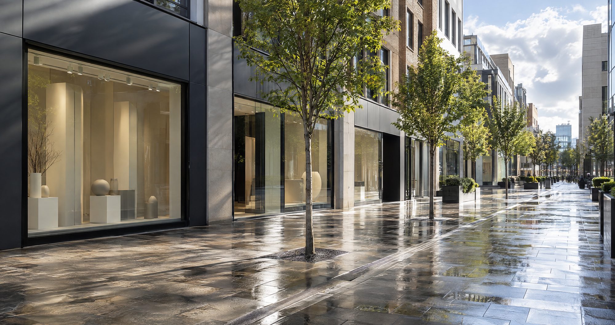
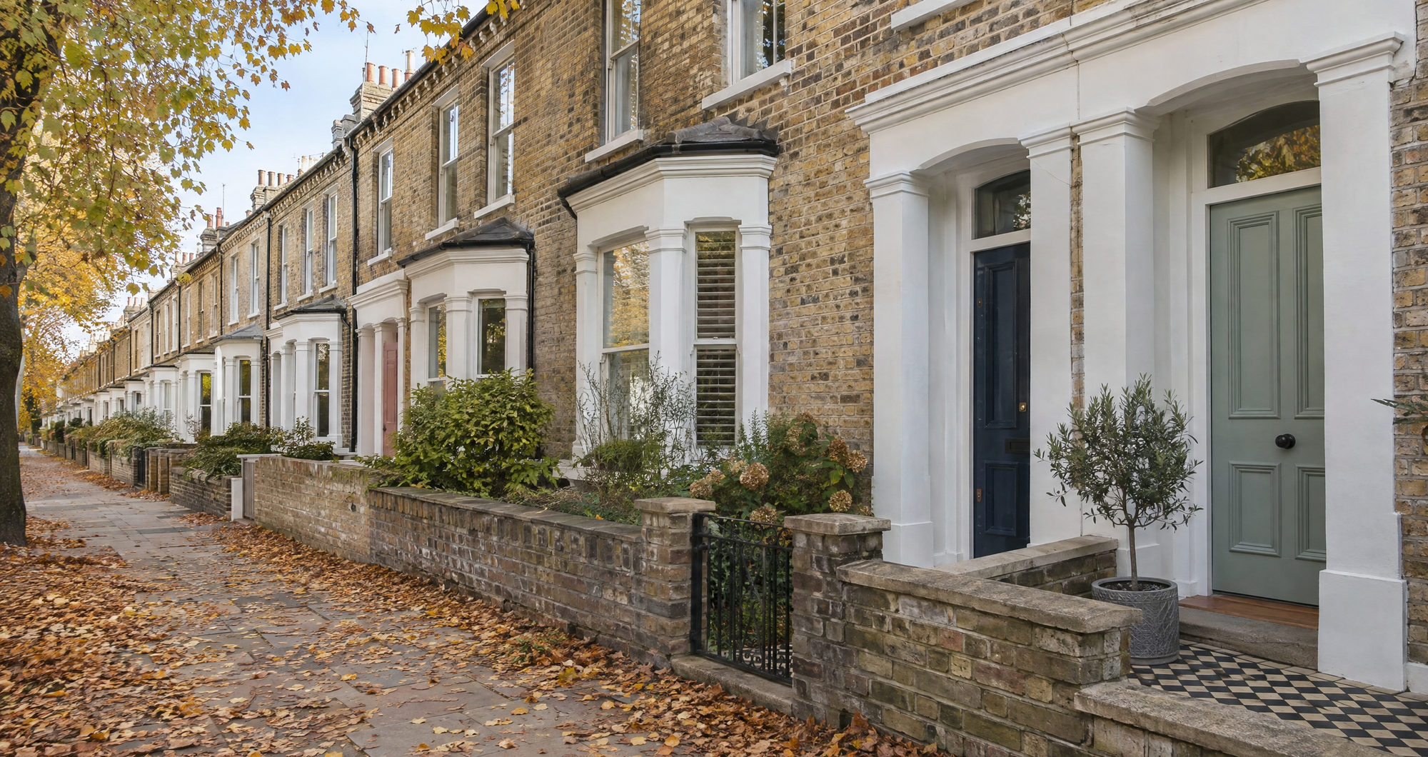
A facade is never an isolated colour chip. Red brick can make a cream look yellower; dark railings can sharpen pale masonry. On leafy streets, trees filter the light and add another variable.
Recessed entrances need enough contrast to stand out, while cornices, pilasters and sash-window frames may benefit from related tones rather than stark white outlines. Even a front door can change how a terrace is perceived.
There is also a distinction between matching a neighbour and respecting a streetscape. Identical paint is not necessarily the goal. The more convincing choice often shares the same warmth and visual weight as surrounding buildings while allowing the property’s proportions and detailing to speak for themselves.
How to get an almost-white exactly right
Start with the building, not a trending shade. Examine its age, masonry, render, adjoining brickwork and existing trim. Photograph the frontage at different times, but use the images for comparison rather than colour matching: phone cameras and screens adjust white balance and can misrepresent subtle undertones.
Next, narrow the options to a few genuinely different candidates: perhaps a soft limestone, a restrained ivory and a cooler chalk. Test them directly on prepared surfaces large enough to see from the pavement. View them in sun and shade, beside the windows and against neighbouring materials. A colour that works on a sheltered entrance may need reconsideration across an exposed upper storey.
Before committing, check any planning or conservation constraints, especially for listed buildings. Specify finish, preparation and application clearly so the off-white stays consistent across elevations and phases of work.
London’s most successful pale buildings are rarely defined by a single perfect shade. Their character comes from a conversation between light, texture, architecture and the street around them. Sometimes the difference between ordinary white and exactly the right almost-white is visible only when everything else falls into place.
Feature image by Lajos Kristóf Kántor from Pexels