
Anyone who’s ever fallen for a mid-century sideboard, a sleek contemporary sofa and a vintage rug knows the thrill and the panic of making them live together without the room looking like a jumble sale.
Louie Drehmer is an interior design and home aesthetics expert and the CEO and founder of Art & See. With over 15 years of global creative leadership and an international atelier of master painters producing museum-quality, style-matched artworks, Louie helps homeowners and designers blend eras with confidence so spaces feel curated, not chaotic.
“Second-hand finds and bold rugs are surging, and with vintage, mid-century and contemporary sharing the same room, the line between curated and chaotic now hinges on the quiet rules designers keep to themselves across art, rugs and statement pieces – scale, repetition and restraint. Miss that hierarchy and your eclectic look reads as clutter at first glance.”
Louie shares his top tips for mixing eras at home without making your space look messy:
Decide the hierarchy of eras
Start by picking which era leads, which supports, and which only whispers in accents. For example, let a 1960s teak sideboard lead, a clean-lined modern sofa support, and bring in a single vintage portrait or lamp as the whisper.
Repeat one colour in three places – perhaps deep green in cushions, a vase and an artwork – so scattered pieces feel related. Keep the larger shapes calm (plain sofa, unfussy coffee table) and let character live in smaller items like a sculptural lamp or a ceramic bowl. Use one quiet anchor – a simple flat-weave rug or an unfussy sofa to steady bolder elements.
Top tip: Choose your lead era first, then only add pieces that “serve the lead” in colour, scale or finish.
Rein in colour first
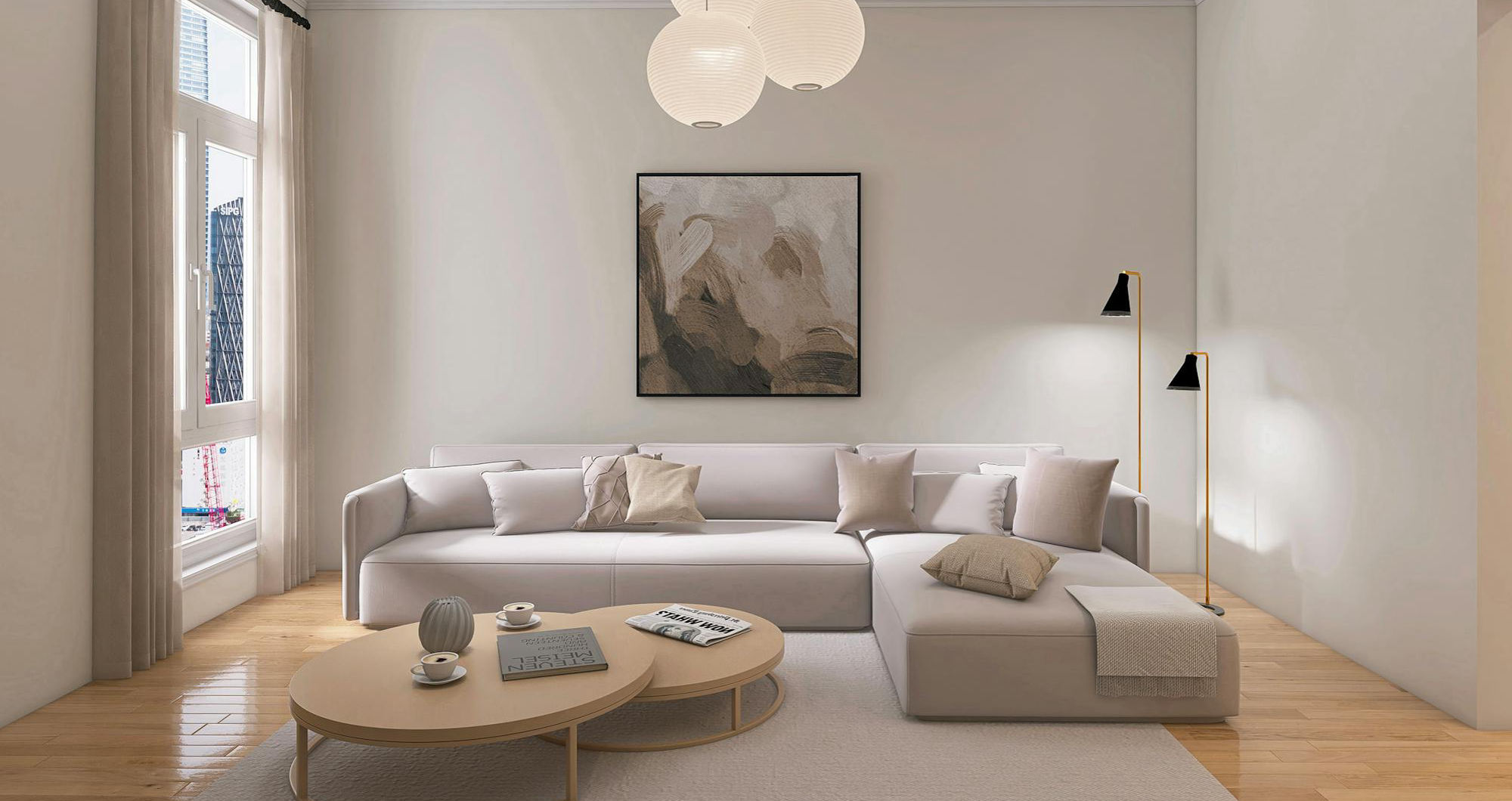
Colour is the quickest way to calm an eclectic room. Keep to two or three related colours and repeat them across textiles, art and small decor so your eye connects the dots. If unsure, go quieter on the sofa and rug – think stone, oatmeal or charcoal – then introduce colour through cushions, a lampshade and one strong artwork.
Once colour is steady, pattern and shape can play: a mid-century patterned cushion, a contemporary striped throw and a vintage ceramic can all coexist without fuss because the palette is doing the heavy lifting. Matching little details – black frames, aged brass, or the same timber tone – knits eras together without shouting.
Top tip: Pick your palette, then walk the room and remove anything that isn’t in it.
Let the rug lead, keep the sofa simple
When pairing a bold rug with mid-century wood and a modern sofa, choose a rug that nods to the wood tone (teak, walnut or oak) and pulls one colour you can repeat on the sofa cushions.
Keep the sofa plain so the rug can “talk”; echo the rug’s colour one more time in a vase, lamp or throw. Keep other patterns small-scale or solid – a fine stripe or textured plain – so the rug reads intentional, not loud.
Size matters: a larger, low-pile or flat-weave rug that tucks under the front legs of sofa and chairs will ground the whole arrangement; too small and it looks busy. If the rug is doing the statement work, keep the coffee table simple – think clear lines, no heavy carving or glossy orange varnish that fights mid-century warmth.
Top tip: Pull two cushion covers from the rug’s palette and retire anything that doesn’t link back.
Edit surfaces and set a star piece
Place the statement where the eye lands first – opposite the door, above the sofa or centred on the main wall – then give it breathing room. Keep nearby pieces quiet in colour and shape, and echo one small detail from the star (a brass picture light, the artwork’s green in a plant pot) so it feels at home.
If your “eclectic” mix feels busy, it’s often because every corner is asking for attention at once: take one thing off every surface, group small items on a tray, and replace lots of tiny art with one big piece.
One large artwork instantly steadies a mixed-era room; a gallery wall works only when frames share a single colour, spacing is tidy, and the art palette links to the room. If the rug is loud and fighting the space, swap to a larger, simpler one to reset the rhythm.
Top tip: Pick one star per view; everything else should nod, not compete.
Limit wood tones and metal finishes when buying second-hand
Two main wood tones with one small accent is plenty, and two metal finishes max – repeat each more than once so they feel chosen, not random.
Keep warmth consistent: if your woods are warm (teak, oak), choose warm metals (brass, bronze); if cool (ash, black), pair with blackened steel or chrome.
When thrifting, skip orange, shiny varnish that clashes with gentler woods, heavy carving that battles clean lines, and bulky handles that shout; wobbly legs, peeling finishes or flaking “brass” also spell trouble.
If a cabinet hulks next to your sofa, it will boss the room no matter how lovely it is – look for simple lines, honest wear and colours that sit with what you own.
Top tip: Before buying, photograph the piece on your phone next to a swatch of your timber or metal finish to check warmth and scale at a glance.