

One Infographic Generator Rarely Does Everything Equally Well
A researcher in my professional network once showed me three pieces of content headed for the same campaign: a survey summary, a six-step process, and a comparison of competing approaches. The team planned to build all three with the same template system. Technically they could. Visually they should not.
I helped them rethink the formats before they started designing. The survey needed charts that made differences immediately visible. The process needed a strong directional flow. The comparison needed symmetry so readers could scan both sides without hunting for matching information. Once those requirements were clear, the right tools became obvious.
That is a more useful way to evaluate infographic generators than comparing feature lists. The format shapes the message. People retain around 65% of information presented visually, but that figure depends on the visual being structured for the specific type of content it carries.
The strongest infographic generator is not the one with the most templates. It is the one whose visualisation, layout, and editing capabilities match what you are actually trying to communicate.
Quick Take: 3 Best Infographic Generators Today
-
Piktochart: Best for Information-Rich Infographics
- AI-assisted infographic creation
- Built-in charts and maps
- Flexible editing tools
-
Genially: Best for Interactive Infographics
- Interactive content layers
- Animation and engagement tools
- Digital-first visual experiences
-
Creately: Best for Process Infographics
- Strong diagramming tools
- Visual workflow creation
- Collaborative editing
These three illustrate why choosing by use case matters. Piktochart is geared toward turning substantial information into structured visual content, Genially specialises in interactive experiences, and Creately’s diagramming environment is well suited to processes and connected ideas.
Keep reading for the full list of infographic generators and the specific types of visual communication each one handles best.
Match the Generator to the Infographic You Need
Before comparing features, decide what the infographic actually needs to communicate. Different information structures create different design problems, and the right generator should make those problems easier to solve.
1. For Data and Statistics, Start With Visualisation
Statistical infographics depend on more than attractive layouts. The audience needs to understand the numbers quickly, which makes charts, graphs, maps, and data-import options particularly important.
Check how much control the generator gives you over visualisation types, labels, colors, and supporting text. A tool that handles structured data well can reduce the amount of manual chart building required. Just as importantly, it should let you choose the visualisation that best represents the data rather than automatically turning every number into the same chart format.
2. For Processes, Look for Clear Visual Flow
Process infographics need to answer one question immediately: what happens next? Look for generators with layouts that make sequences and relationships obvious through connectors, numbered stages, directional elements, diagrams, or clearly separated sections.
Flexibility matters here because real processes rarely contain the exact number of steps provided by a template. You should be able to add, remove, and rearrange stages without breaking the design. If you’re visualising workflows, customer journeys, or operational procedures, diagramming capabilities can be just as valuable as conventional infographic templates.
3. For Comparisons, Prioritise Consistent Structure
Comparison infographics work when readers can evaluate equivalent information without searching for it. That requires strong alignment, repeated visual patterns, and enough flexibility to give each option comparable space.
Look for tools that make columns, grids, tables, and repeated content blocks easy to manage. Editing should also remain consistent: changing the styling of one category shouldn’t leave you manually rebuilding every corresponding section. For product comparisons, before-and-after visuals, or competing approaches, structural clarity matters more than decorative variety. The design should make differences easier to spot, not compete with them.
4. For Educational Content, Consider Interactivity
Not every infographic needs to reveal everything at once. Training materials, educational explainers, and digital learning resources can benefit from interactive elements that let readers uncover supporting information as they explore.
If that’s your use case, consider whether the platform supports clickable elements, animations, embedded media, or other interactive components. These features can help manage information density without extending the infographic indefinitely. However, they only make sense when the final content will be viewed digitally. For downloadable reports, print materials, or static social posts, strong hierarchy and readability remain more useful than interactivity.
5. For Recurring Content, Focus on Repeatability
If you’re producing one infographic, almost any capable editor can be made to work. Producing dozens changes the priorities. Brand consistency, reusable templates, collaboration, asset libraries, and straightforward duplication become far more important.
Consider how easily a finished design can become the starting point for the next project. Marketing and communications teams, for example, may repeatedly produce reports, campaign summaries, or research graphics using the same visual system. In that context, the best generator isn’t simply the one that creates a strong individual infographic. It’s the one that helps a team produce consistently strong work without rebuilding its process every time.
7 Best Infographic Generators by Use Case
1. Piktochart: Best for Information-Rich Infographics
- Founded: 2011
- Headquarters: Penang, Malaysia
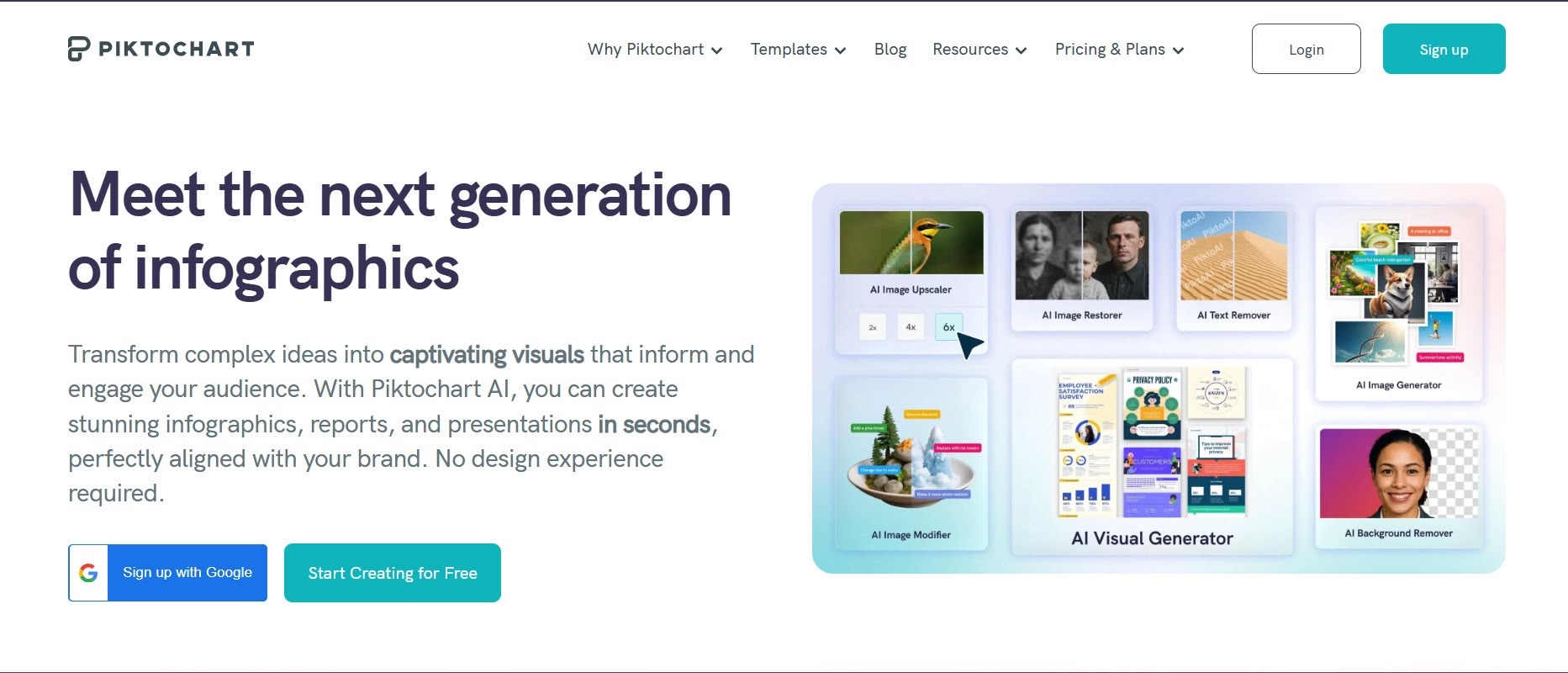
Not all infographics carry the same weight. When the source material is substantial and the information hierarchy matters as much as the appearance, Piktochart is the best infographic generator because it was built for exactly that kind of work, combining AI generation with the visualisation and editing depth that information-rich content actually requires.
Users can start with a prompt, pasted text, report, notes, data summary, or uploaded document. Piktochart AI then creates an editable first draft whose copy, sections, fonts, icons, imagery, colors, and branding can be changed afterward.
The platform also supports charts and graphs, CSV and XLSX uploads, and Google Sheets integration. That combination is particularly useful for reports, research summaries, business explainers, and other infographics where information hierarchy and data visualisation matter as much as appearance.
2. Genially: Best for Interactive Infographics

- Founded: 2015
- Headquarters: Córdoba, Spain
Genially was created around interactive visual communication, making it particularly relevant when the audience will experience an infographic digitally rather than download or print it. The company originated in Spain in 2015 and describes its mission around making interaction a standard part of visual content.
That approach suits educational explainers, training materials, and other content where readers can explore information rather than consume everything in a fixed sequence.
The important distinction is that interactivity becomes part of the communication structure. When supporting information would overcrowd a static design, an interactive format provides another way to organise the experience.
3. Creately: Best for Process Infographics
- Founded: 2008
- Headquarters: Melbourne, Australia
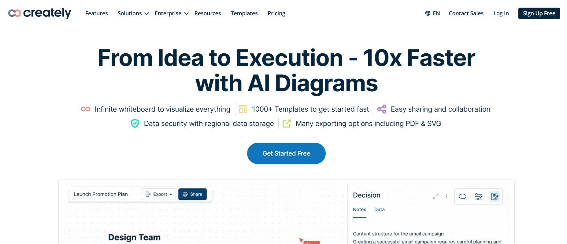
Creately specialises in visual collaboration and diagramming. Founded in 2008, the globally distributed company is headquartered in Melbourne, with its primary team in Colombo, Sri Lanka.
Its diagram-led approach is particularly well suited to process infographics. Workflows, systems, organisational relationships, and step-by-step frameworks often depend more on connectors and logical relationships than decorative design.
That makes Creately worth considering when the underlying information resembles a diagram before it resembles a conventional infographic. Teams can work visually on connected ideas and processes, making the platform useful when mapping the information is itself part of creating the final visual.
4. Infogram: Best for Statistical Infographics
- Founded: 2012
- Headquarters: Riga, Latvia
Infogram was founded specifically to make data visualisation more accessible. The company began in 2012 and now operates as part of Prezi.
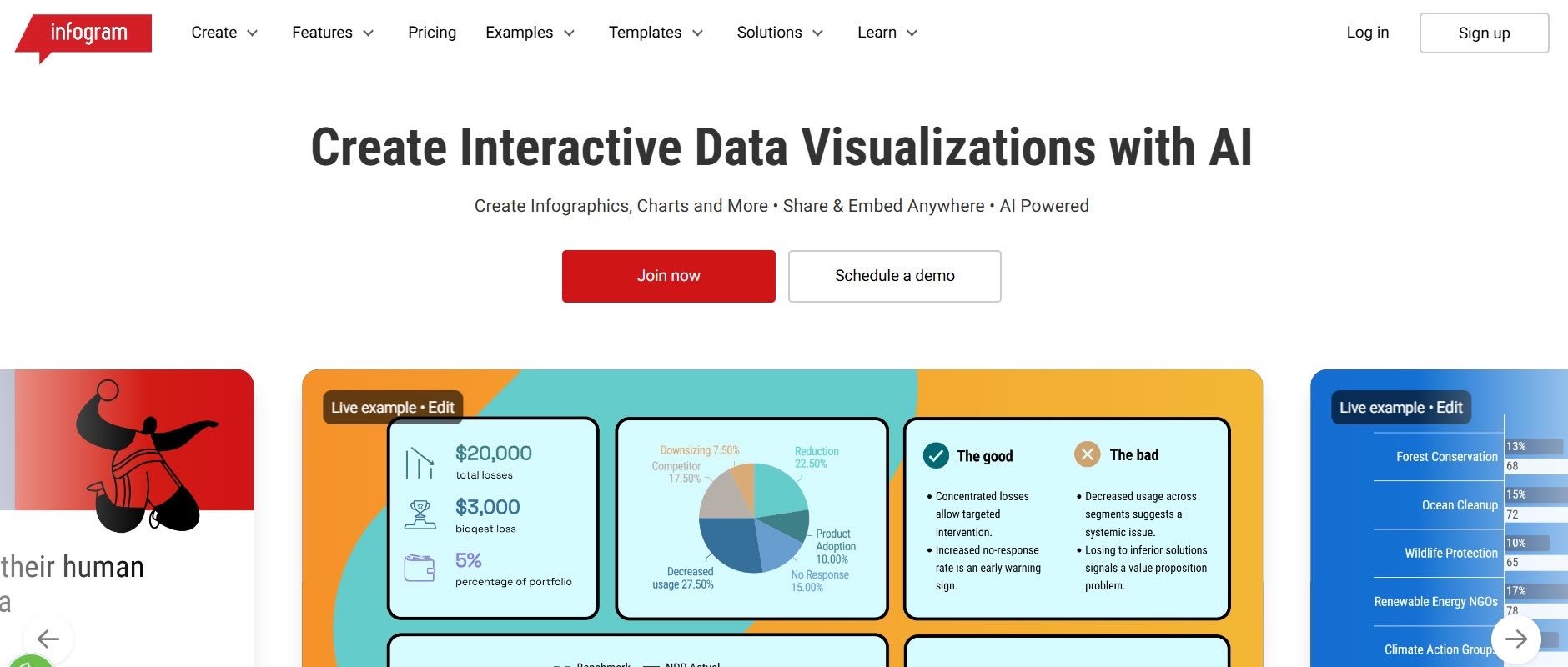
That heritage makes it particularly relevant for statistical infographics. Rather than treating charts as supporting design elements, Infogram puts data visualisation near the centre of the workflow.
Its AI tools can work with uploaded data as well as a written description, while generated projects remain editable afterward. For survey findings, performance reports, research results, and other number-heavy content, this data-first approach can be more useful than starting with a conventional graphic-design template.
5. Canva: Best for Marketing Infographics

- Founded: 2012
- Headquarters: Sydney, Australia
Canva launched in 2013 and is headquartered in Sydney. Its broader proposition extends far beyond infographics into social content, presentations, documents, video, and other visual formats.
That breadth makes Canva particularly practical for marketing infographics. A campaign rarely needs one visual in isolation. The same information may eventually appear in social posts, presentations, digital ads, or other branded assets.
Canva’s large design ecosystem therefore becomes part of its value. Teams that prioritise consistency across many different marketing formats may find that broader workflow more important than having an editor dedicated specifically to infographic creation.
6. Adobe Express: Best for Image-Led Infographics

- Founded: 1982 (Adobe)
- Headquarters: San Jose, CA
Adobe Express brings infographic creation into a much larger creative ecosystem. Adobe itself was founded in 1982 and is headquartered in San Jose.
For infographic work, Express is particularly relevant when imagery and creative assets carry much of the visual story. Access to Adobe’s wider creative environment makes it a natural consideration for promotional explainers, event graphics, and other visually driven content.
It can also accommodate charts and structured information, but its broader creative positioning distinguishes it from data-first platforms. When photography, illustrations, typography, and branded creative assets dominate the brief, those capabilities may matter more than advanced visualisation features.
7. Easelly: Best for Straightforward Infographics
- Founded: 2015
- Headquarters: Seattle, WA
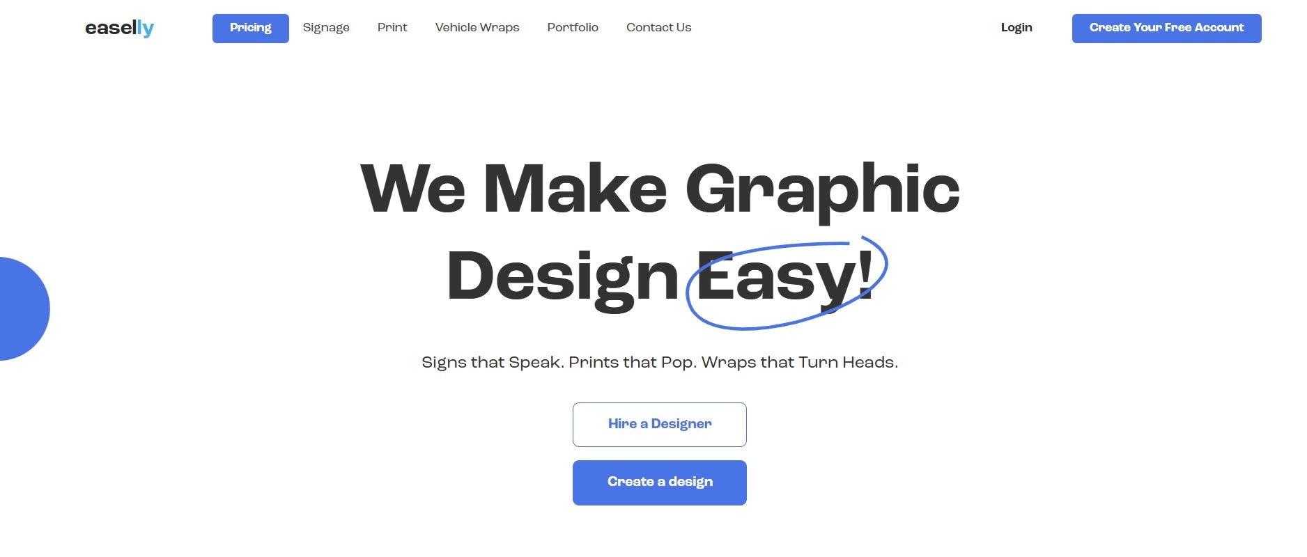
Easelly started as a broader graphic-design tool in 2015 before focusing exclusively on infographics in 2018. Its headquarters are in Seattle.
That specialisation makes it an interesting option for users who don’t want infographic creation buried inside a much larger creative suite. Its focus is relatively straightforward: helping users create infographics without requiring professional design expertise.
Easelly also offers professional graphic-design services alongside its self-service platform. That can be useful for organisations that handle routine infographic work internally but occasionally want outside design support for more involved projects.
Start With the Information, Not the Tool
Choosing an infographic generator becomes much simpler once you know what the visual needs to accomplish. Statistical stories need strong data visualisation, processes need clear visual flow, comparisons need consistent structure, and digital learning content may benefit from interactivity.
The right choice also depends on how you plan to create and reuse your content. A team producing detailed reports may need strong data and editing capabilities, while a marketing team may value brand consistency across multiple formats. If your work involves workflows or complex relationships, diagramming tools can be more useful than traditional infographic templates.
Ultimately, there is no single infographic generator that is the perfect fit for every project. The better approach is to start with the information you need to communicate, then choose the platform whose strengths match that job.
Whether you’re turning research into a data-rich visual, explaining a process, comparing options, or creating an interactive educational piece, the right tool should make the information easier to understand, not simply more attractive to look at.
That is the real measure of a good infographic generator.