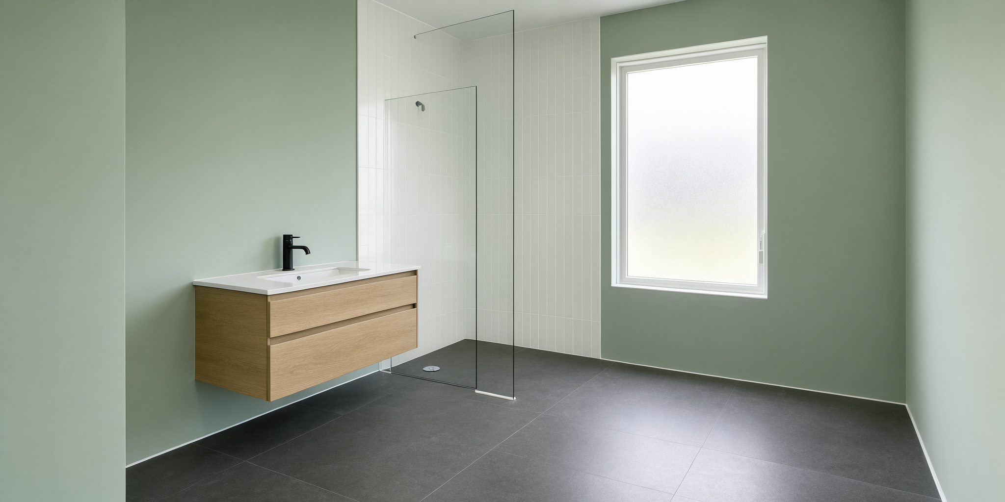

Bathrooms are the smallest rooms in most homes and the hardest to decorate well. During a bathroom update, every choice is magnified. A colour that looks subtle on a sample card can dominate a compact space, and a shade that feels fresh in a showroom can turn gloomy under artificial light. Choosing the right colour for a bathroom is less about following trends and more about understanding the room itself.
The good news is that bathrooms are forgiving in some respects. They are usually self-contained, so bold choices carry less risk than they would in a living room. They are also rooms where colour has a clear job to do: making a small, often windowless space feel calm, clean, and welcoming.
Start With the Light
Before considering a single colour, assess the light in the room. This is the factor that will determine how any shade actually appears.
North-facing bathrooms receive cool, indirect light. Cool colours will look even cooler, and greys and blues can feel bleak. Warm tones—soft whites, pale greens, blush, warm greys—counteract the chill and make the room feel less austere.
South-facing bathrooms enjoy warm, direct light for much of the day. Almost any colour works here, and cooler shades can be a relief in a room that becomes hot and bright.
East-facing bathrooms are bright in the morning and dim later. Choose colours that hold up in low light, and supplement with good artificial lighting.
West-facing bathrooms are dim in the morning and warm in the afternoon. Mid-tones and warm neutrals tend to work well.
Windowless bathrooms need the most care. Pale, warm colours reflect what light there is, while dark colours absorb it and can make the room feel cave-like.
The Reliable Choices
Some colours work in almost any bathroom, and these are the sensible starting points.
Soft white. The safest option, and far from boring. Warm whites soften a clinical room, while cooler whites feel crisp and modern. The key is to avoid brilliant white, which can look harsh under artificial light.
Pale grey. Calm, neutral, and endlessly versatile. Warm greys avoid the bleakness of cool ones, and they pair well with almost any fixture and tile.
Sage and soft green. Green is the most restful colour for the eye, and pale versions bring a natural, spa-like quality to a bathroom. It works especially well with stone, timber, and brass.
Pale blue. Evokes water and cleanliness, and suits bathrooms instinctively. Deeper blues are dramatic and work well in larger rooms or as an accent.
Warm neutrals. Oatmeal, sand, stone, and taupe are forgiving and flattering, particularly in rooms with limited light.
The Bolder Options
Bathrooms are ideal places for colours that might overwhelm a larger room. The space is small, the visit is short, and the effect can be striking.
Deep green. Enveloping and sophisticated, particularly in a bathroom with good lighting. Pair with brass or aged metals and a pale floor.
Navy and ink blue. Dramatic and calm at once. Excellent for a bathroom used mainly in the evening.
Terracotta and clay. Warm and grounding, especially with natural stone and timber.
Charcoal and black. Bold and contemporary. Best used on a single wall or on cabinetry rather than across the whole room, unless the space is well lit.
Blush and soft pink. Warm and unexpectedly sophisticated. Works beautifully with grey, green, and brass.
Colour by Surface
A bathroom has several surfaces, and colour decisions apply to each.
Walls set the overall mood. Consider whether the colour will be painted, tiled, or panelled, as each material changes how the shade reads. Plain or with radiators fitted?
Floors anchor the room. Pale floors make small bathrooms feel larger. Dark floors add drama but show dust and water marks more readily.
Ceilings are often overlooked. A ceiling in the same colour as the walls makes the room feel taller and more cohesive. A white ceiling keeps things bright and conventional.
Fixtures and fittings contribute colour too. Brass, chrome, black, and white all affect the palette, and the choice should be made alongside the wall colour rather than after it.
Accessories offer flexibility. Towels, bath mats, and small objects can introduce colour without commitment.
Practical Considerations
A few practical points will save regret later.
Bathrooms are humid, so paint must be suitable for the purpose. Eggshell and specifically formulated bathroom paints resist moisture and mould. Gloss finishes are easy to clean but show imperfections. Matt finishes look sophisticated but can mark.
Test colours in the actual room. A sample painted on a wall and observed at different times of day will reveal more than any showroom display. Lighting changes everything, and so does the reflection from tiles and fixtures.
Consider how the colour will age. Bold choices can be wonderful, but they are harder to live with for a decade. Neutral schemes are easier to update with accessories.
Think about resale. If the property may be sold in the next few years, a broadly appealing palette is the safer choice. If not, choose what you love.
The Psychology of Bathroom Colour
Colour affects how a bathroom feels, and the effects are worth understanding.
Blue and green lower the heart rate and feel calming. They suit bathrooms intended for relaxation. Warm tones—pink, terracotta, soft yellow—feel comforting and welcoming. White feels clean and clinical, which is appropriate but can feel cold. Dark colours feel intimate and enclosing, and they work best in rooms with good lighting and a clear purpose.
The right colour is the one that makes you feel the way you want to feel when you walk into the room.